Forgotten Branding Settings That Break M365 Consistency

Forgotten Branding Settings That Break M365 Consistency

Ever noticed how your company logo looks perfect in Teams, but disappears when users hit the login screen or open SharePoint? We’re about to reveal why those tiny branding gaps can hurt trust and user confidence—and exactly where most businesses go wrong inside M365.Most admins fix the obvious settings and miss the hidden ones. Stick around and we’ll map out the real trouble spots you can’t afford to overlook if you want true, end-to-end consistency.The Hidden Cost of Forgetting Your BrandIf you’ve ever watched employees bounce from Teams to SharePoint to the login screen, eyebrows furrowed, you already know the feeling. Teams is smooth, the logo’s right, colors dialed in. But SharePoint? Suddenly, it’s a mess of blues and whites. Out comes the default Microsoft logo. Open the login screen and now it’s Office 365 orange with no sign of your company’s colors anywhere. Most users won’t say a word, but you’ll see that look—“Am I even in the right place?” That creeping sense of, “Did I just get phished?” Even when they’re staring at perfectly legitimate company resources, a little doubt sets in.Let’s pin down exactly how this plays out. Picture an employee starting their morning. They open Teams, see your company’s blue and gold banner, maybe even a custom icon. It almost feels like home. Five minutes later, they need a client file so they jump to SharePoint. Suddenly, everything’s boxy, brand colors are gone, and there's a default SharePoint logo up top. Navigation feels different—like wandering into somebody else’s office by accident. Then, when they hit the Office 365 login screen later, they see Microsoft’s branding, no trace of the company’s look, and maybe even a generic background image. These micro-contrasts seem harmless, but for users, they signal disconnection. No matter how many posters you hang about cyber security or digital trust, that instant hesitation pops up. Nothing tanks confidence faster.Now, let’s ground this in the real world. I worked with a manufacturing firm that invested a chunk of budget rolling out Teams globally. They set up custom logos, configured the perfect accent color, and even tuned notifications. But SharePoint was still running the vanilla Microsoft theme. Login screens? Still orange and white. No custom banners. After launch, tickets rolled in: users thought they’d landed on untrusted sites. One group reported they’d accidentally sent sensitive files through personal email, just because they couldn’t recognize “their” SharePoint. Adoption lagged. Three months later, execs asked if the Teams push was broken. It wasn’t the tools—it was that whiplash from branded to default, over and over.The more you look into it, the less surprising it gets. Dr. Susan Weinschenk, a behavioral psychologist, points out that “users make decisions about trust in under a second, based on visual cues.” Companies pour resources into securing their environments, but inconsistent branding leaves visual trails that whisper, “you’re not home.” In fact, studies from the Nielsen Norman Group show that interface inconsistency increases cognitive load—meaning people have to think harder to confirm they’re safe, or even that they’re working in the right place. The more steps it takes for an employee to orient themselves, the slower things get. And when that trust erodes, adoption takes a hit.Let’s talk about where Microsoft itself gets in the way. Even if you customize every possible surface today, a default theme is always lurking. Microsoft’s design updates happen behind the scenes—sometimes without warning. Suddenly, a button or banner quietly reverts to the standard blue, and users notice before admins do. It’s like tidying up three rooms of your house, then having a contractor repaint the hallway without asking. HR announces “we’re one team” but login pages still push Microsoft’s brand front and center. That disconnect seeps into company culture, eroding the sense of unity you’re trying to build.It might sound like nitpicking, but there’s data behind the pain. According to research by IDC, companies lose up to 20% in productivity from users feeling disconnected from their digital workspace. Visual inconsistency is a major culprit—little moments of second-guessing, seconds wasted hunting for confirmation, and time lost switching between mindsets. There’s no line item on the budget for confusion, but it all adds up. Every time an employee second-guesses their workspace, process flow gets interrupted.Now, imagine if you could close these tiny branding gaps for good. No more awkward login screens or default logos peeking through. Users sit down, open any M365 app, and immediately know they’re in company territory. That sense of familiarity builds trust—not just in your tools, but in the bigger picture decisions IT makes.Consistent branding goes far beyond just planting a logo everywhere. It’s about smooth handoffs between apps and reinforcing that “this is us” feeling every time someone logs in, collaborates, or shares data. When things feel unified, people work faster and hesitate less. They know a link or notification is “real,” and new tools land with less friction. It’s a win nobody celebrates—until you see how much smoother everything runs.Most admins only tweak what’s obvious—the Teams icon, SharePoint’s main color. The real branding problems hide deeper, in corners most people never visit until it’s too late. Those overlooked settings are where consistency dies. So let’s dig into what you can—and can’t—actually brand, and why it matters.What You Can—and Can’t—Actually CustomizeMost admins could probably name the big three when it comes to M365 branding: slap a logo on Teams, pick a SharePoint site accent color, and maybe swap out the background image on the login page. That’s where most branding projects begin—and unfortunately, where a lot of them end. You get a fancy new logo on Teams meetings, SharePoint has a blue or green splash, and the login screen isn’t as cold. It feels like the work is done, but if you ask actual end users, cracks show up almost instantly.Let’s run through what people normally remember to touch. The Teams admin center gives you a spot for a custom organization logo and, if you go digging, brand color settings. Within SharePoint Online, you can push a custom theme: company palette, navigation font, even a default SharePoint logo. Most folks also remember to head to the Azure portal, maybe upload a logo for the sign-in page so it doesn’t scream “Microsoft” quite as loudly. If you’ve done these three, you might feel covered. At this point, it all looks solid at a glance.Now here’s where the fun starts. All it takes is a password reset, a login from a phone, or a user landing on an error page. Suddenly, your visuals drop away and Microsoft’s defaults jump right back in. Those secondary spots? Most admins don’t even know they exist, until a user forwards a screenshot that ruins your morning. The password reset screen uses whatever branding lives in Azure AD—even if you’ve refreshed everywhere else. Forgot to check the mobile Teams app splash screen? Microsoft’s purple flag waves in front of your company every time someone opens the app. There are subtle backgrounds—like generic gray swaths behind login modals, or the SharePoint “loading” animation—that can’t be touched. Go to a page not found or hit an error, and it’s a full Microsoft design. Try sending a document link to external guests; they often see the out-of-the-box Microsoft invitation, not your logo or brand at all.So, what exactly can you—and can’t you—actually control in M365? Let’s break it down, starting with Teams. In the Teams admin center, you get access to “Organization branding,” which covers the app logo, some basic color choices, and the ability to upload a custom banner that shows up on the web. Ribbon color and accent shades are fair game, and you can set a company-specific icon that appears pretty consistently. But Teams on mobile ignores some admin branding entirely—users get Microsoft purple, no matter what you’ve set up. Meeting invitations still show the default Teams icon unless you push a custom mail template. And app tiles inside Teams (like Planner or Yammer) display Microsoft defaults, not your chosen color scheme.SharePoint Online gives you far more to play with: custom themes, header images, navigation styling, and advanced SharePoint “site designs” using scripting. The SharePoint admin center lets you apply your brand as the default across all new sites. But some borders, system-level banners, and automated error messages can’t be touched. List views, system-generated emails, and workflow notifications usually revert right back to Microsoft blue and gray. If you send a site invite, guests are met with the standard “You’ve been invited to SharePoint Online” template—no logo, no custom language, just Microsoft.Then you hit Azure Active Directory (or Entra ID), which might be the most frustrating of all. The login pages—the main one, plus password reset or “Terms of Use” consent prompts—allow a logo, background color, and a single custom illustration banner. But when a user tries to register a new device, review security info, or hits a permissions screen, all branding vanishes. Expired password? That reset flow is stuck on a bland default style unless you deploy branding in all the right corners. Look closely at admin portal screenshots and you’ll spot a pattern: branding sections are hidden under “Company branding,” and Microsoft’s own docs show long tables of which screen picks up which setting—sometimes with a note saying, “not supported in mobile.”Seeing all this mapped out, it’s like painting three walls and leaving the fourth bare. Each missing spot is obvious—once you know where to look. The “before” version: home screens are branded, but password reset or mobile logins are all Microsoft. The “after” if you do everything right: smooth, continuous branding—up until you hit a boundary Micr

Become a supporter of this podcast: https://www.spreaker.com/podcast/m365-fm-modern-work-security-and-productivity-with-microsoft-365--6704921/support.

Tämä jakso on lisätty Podme-palveluun avoimen RSS-syötteen kautta eikä se ole Podmen omaa tuotantoa. Siksi jakso saattaa sisältää mainontaa.

Jaksot(700)

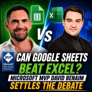
Can Google Sheets Beat Excel: Microsoft MVP David Benaim Settles the Debate

Can Google Sheets Beat Excel: Microsoft MVP David Benaim Settles the Debate

For decades, Microsoft Excel has been the undisputed king of spreadsheets. It powers everything from personal budgets to enterprise reporting, financial modeling, and business intelligence. But Google...

8 Heinä 52min

LinkedIn + Dynamics 365: The Architecture of Modern Selling

LinkedIn + Dynamics 365: The Architecture of Modern Selling

Modern B2B sales is undergoing a fundamental transformation. For years, organizations have treated LinkedIn and Dynamics 365 as separate systems. One platform managed relationships and professional ne...

8 Heinä 1h 14min

Azure Networking Unlocked: Secure Azure Functions, Virtual Network Manager & Infrastructure as Code with Rex de Koning [MVP-MCT]

Azure Networking Unlocked: Secure Azure Functions, Virtual Network Manager & Infrastructure as Code with Rex de Koning [MVP-MCT]

Cloud adoption has accelerated at an incredible pace, but modern cloud infrastructure is no longer just about deploying virtual machines or Azure services. Networking has become the backbone of every ...

7 Heinä 54min

The PowerShell Ceiling: Why You Need Bicep

The PowerShell Ceiling: Why You Need Bicep

Every IT professional eventually reaches a point where automation stops feeling like freedom and starts becoming a burden. What begins as a handful of PowerShell scripts quickly grows into dozens of a...

7 Heinä 1h 9min

Beyond the Prompt: Architecting Multi-Agent AI Solutions with Microsoft Copilot & SharePoint with Reshmee Auckloo [MVP]

Beyond the Prompt: Architecting Multi-Agent AI Solutions with Microsoft Copilot & SharePoint with Reshmee Auckloo [MVP]

Artificial Intelligence is rapidly moving beyond simple chatbots and prompt engineering. Today's enterprise AI solutions must reason, collaborate, orchestrate multiple agents, securely access business...

6 Heinä 1h

How To Trick Microsoft Graph Into Securing Your Entire Tenant

How To Trick Microsoft Graph Into Securing Your Entire Tenant

Most Microsoft 365 administrators believe their tenant is secure because every dashboard is green, policies are enabled, and alerts appear to be flowing normally. Unfortunately, modern security doesn'...

6 Heinä 1h 12min
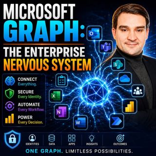
Microsoft Graph: The Enterprise Nervous System

Microsoft Graph: The Enterprise Nervous System

Enterprise IT has reached a tipping point. Organizations now manage millions of identities, files, applications, permissions, policies, and AI-powered workloads across Microsoft 365. Yet many IT depar...

5 Heinä 1h 11min

Beyond the Script: The Architect's Guide to Microsoft Graph Platforms

Beyond the Script: The Architect's Guide to Microsoft Graph Platforms

Automation has become a cornerstone of digital transformation, yet many organizations unknowingly create more complexity than they eliminate. What starts as a simple PowerShell script or Power Automat...

5 Heinä 1h 10min

Suosittua kategoriassa Politiikka ja uutiset

uutiscast
aikalisa
ootsa-kuullut-tasta-2
rss-ootsa-kuullut-tasta
rss-podme-livebox
tervo-halme
otetaan-yhdet
aihe
politiikan-puskaradio
rss-vaalirankkurit-podcast
rss-girls-finish-f1rst
rss-seksicast
the-ulkopolitist
rss-mina-ukkola
rss-aijat-hopottaa-podcast
rss-mita-tapahtuu
rss-kaikki-uusiksi
rss-asiastudio
rss-ulkopoditiikkaa
rss-pinnalla